PLANETSTEWARDS: identity and website design
- Problem
- The imagery showed no human activity.
- What I did
- Co-designed the identity, site and motion piece.
- Outcome
- 1,679 visitors, 61% from abroad.See results
Overview
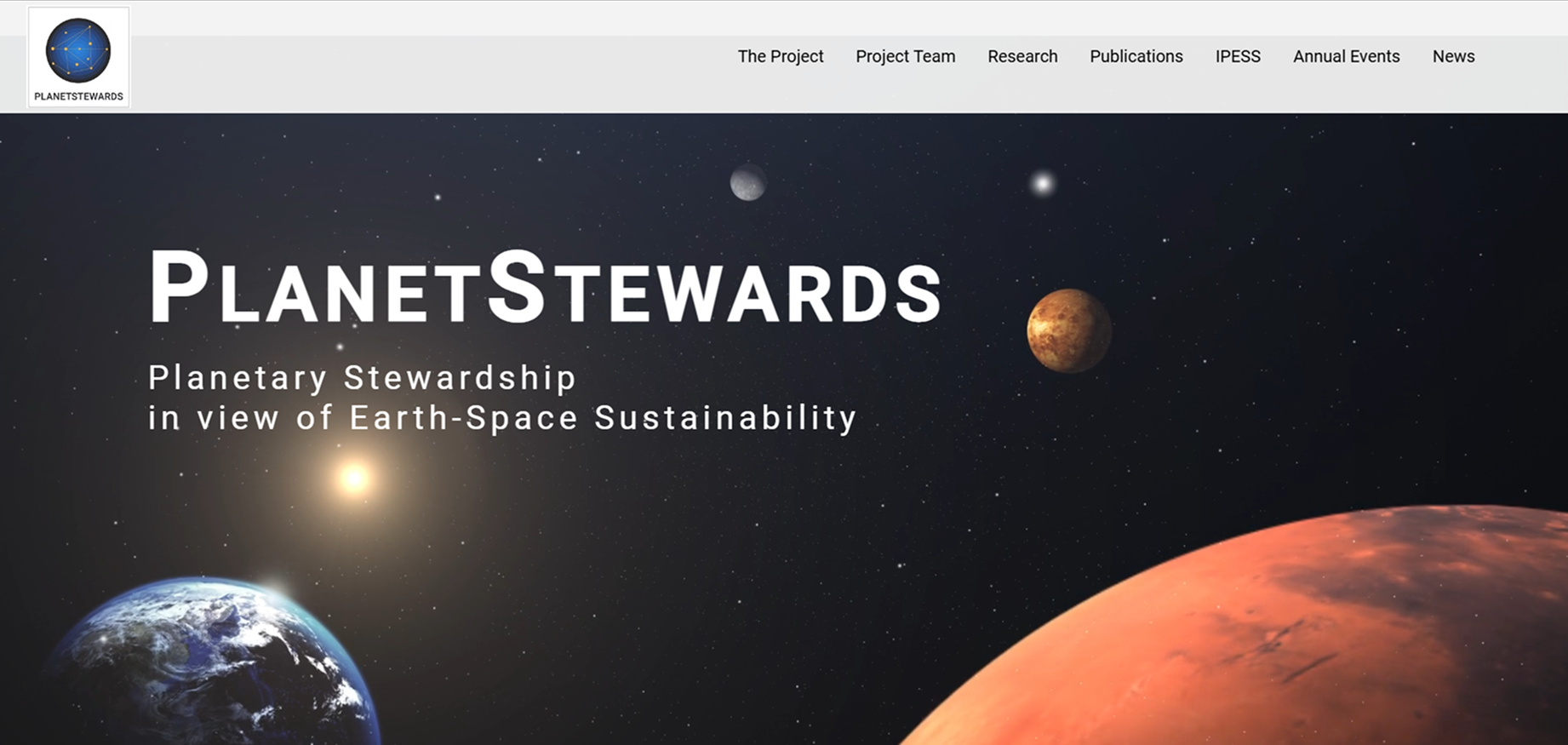
PLANETSTEWARDS studies how human activity in space should be governed. The first imagery read as astronomy: planets, no people, no hardware. A reviewer asked where the human interventions were, and the PI flagged that the pictures didn’t form a storyline. The redesign had to put human presence in orbit, on the Moon and on Mars at the centre of the visual narrative, while staying credible to academic partners.
Requirements and process
- Credible to institutions, approachable to students.
- White-led, even though space is conventionally shown dark.
- A clear path from landing page to abstract submission and registration.
Colour palette
- Brand Blue#003399brand and every primary action
- Brand Yellow#F5B23Fevent and submission buttons, highlights
- White#FFFFFFsection and page backgrounds
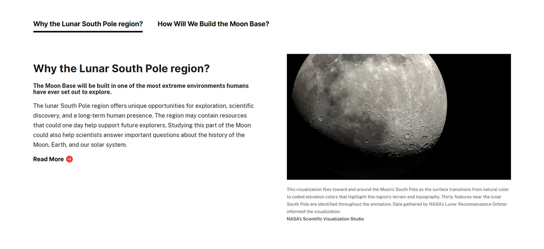
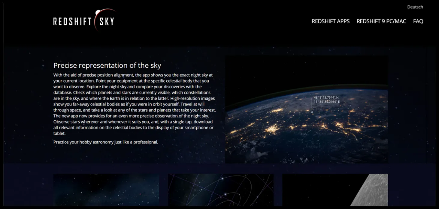
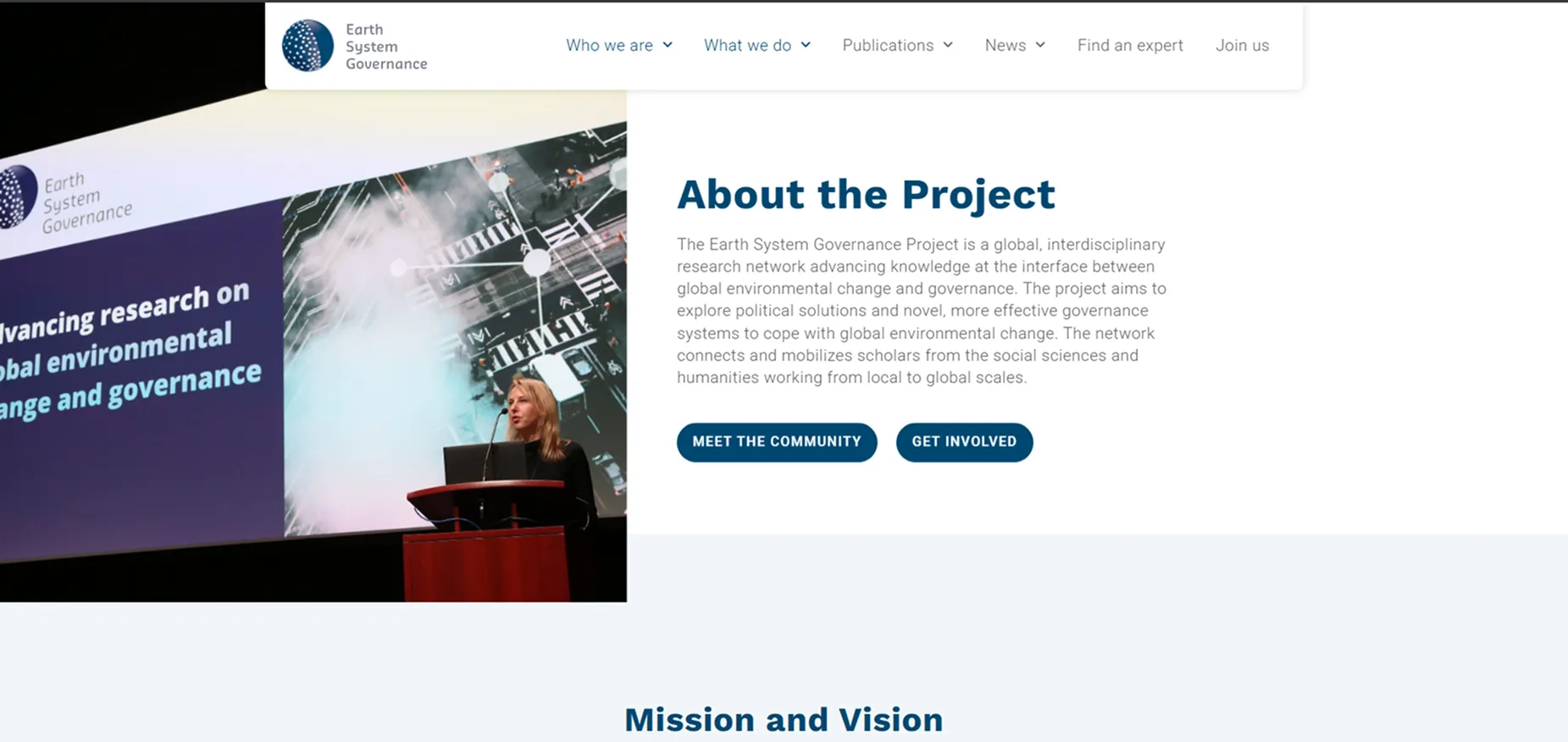
References
Information architecture
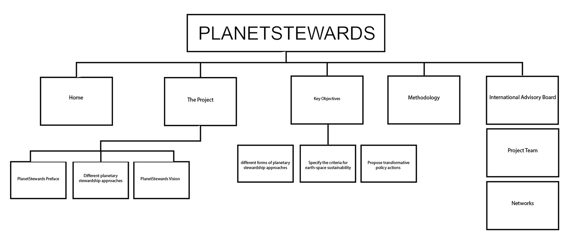
The first sitemap mirrored the research proposal: Home, The Project, Key Objectives, Methodology and an International Advisory Board. It described the project but gave it nowhere to grow. Once the project started publishing papers and running events, the site had to carry outputs and a calendar, not just a description.
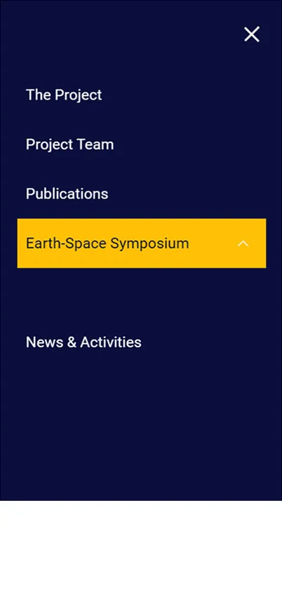
The shipped navigation expanded these pages and added Publications, News and an Annual Events branch. Each year’s event becomes a new page under Annual Events, so the menu never has to be restructured.
Shipped navigation
The Solution
With September Khu, I shaped the site’s visual identity and layout: moodboards and logo concepts, a blue-and-yellow palette with Roboto, and a structure built around the project, team, publications and symposium. I worked on visual hierarchy, image placement and icon styling, and produced the space-debris motion piece.
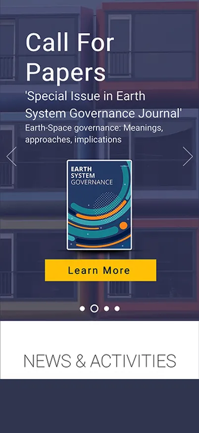
Call for Papers
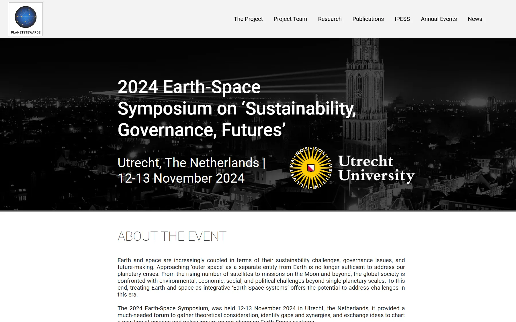
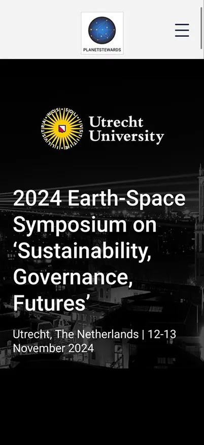
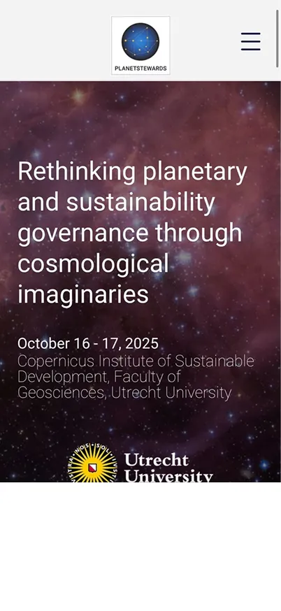
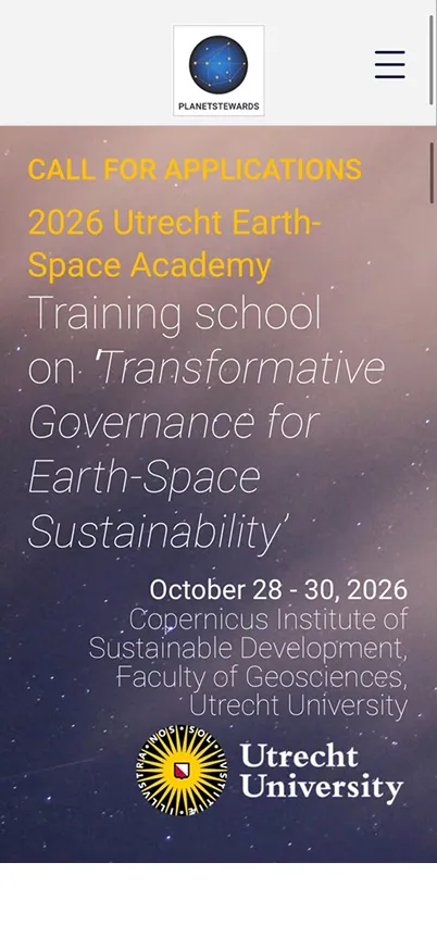
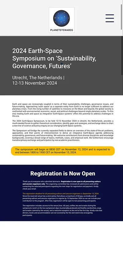
The symposium needed a route from first visit to submitted abstract. The menu highlights the current event, the event page leads to the Call for Papers and its submission form, with the button relabelled from APPLY to SUBMIT.
Feedback and iteration
| Feedback | Source | Response |
|---|---|---|
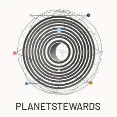
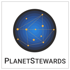
| Logo “very busy”; fewer globe grid lines, or replace the grid with constellation lines and dots. | External reviewer, via the Principal Investigator | Removed the globe grid and kept the constellation lines and dots, the reviewer’s second option. |
| “Where are the human interventions?” | External reviewer | Produced a space-debris motion piece for the homepage. |
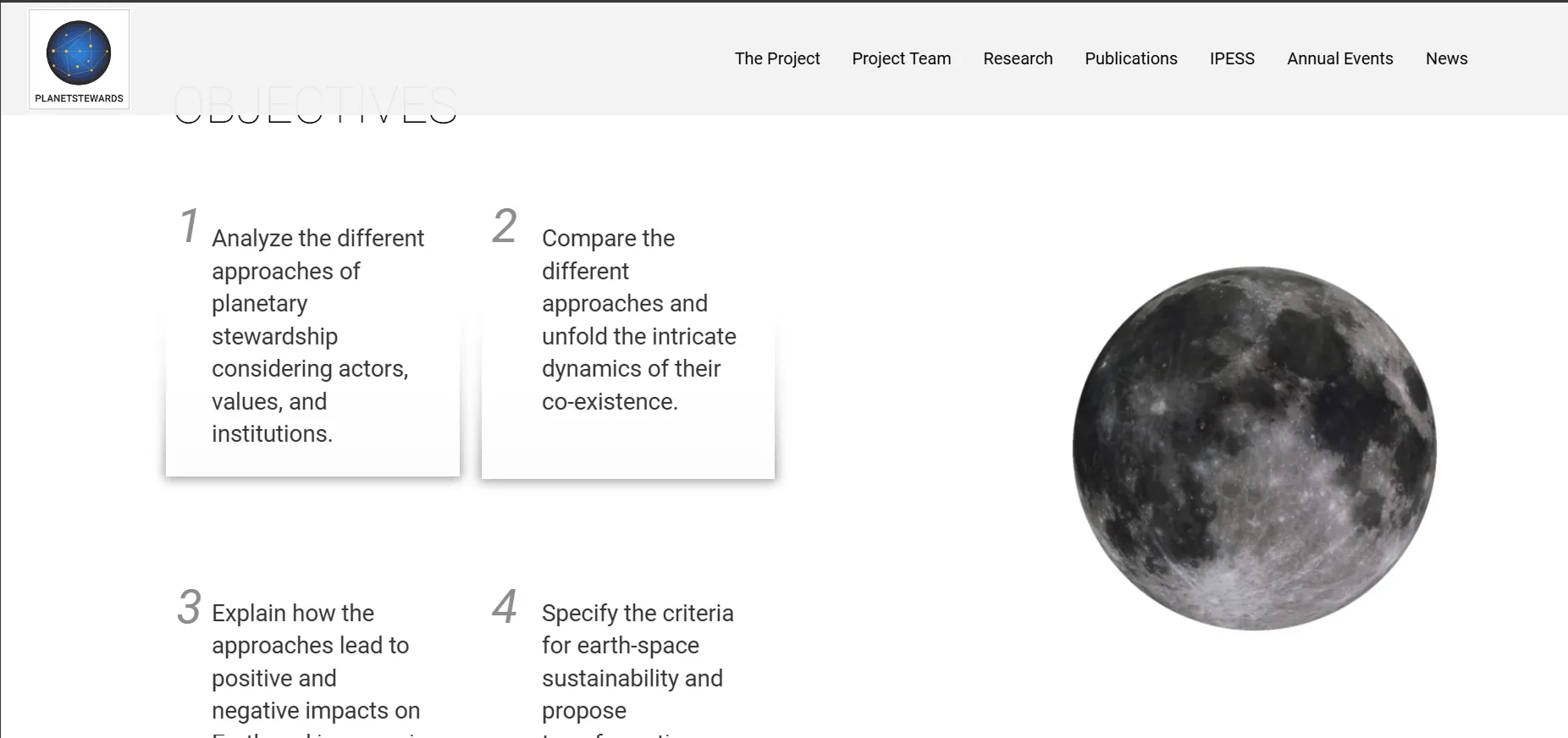
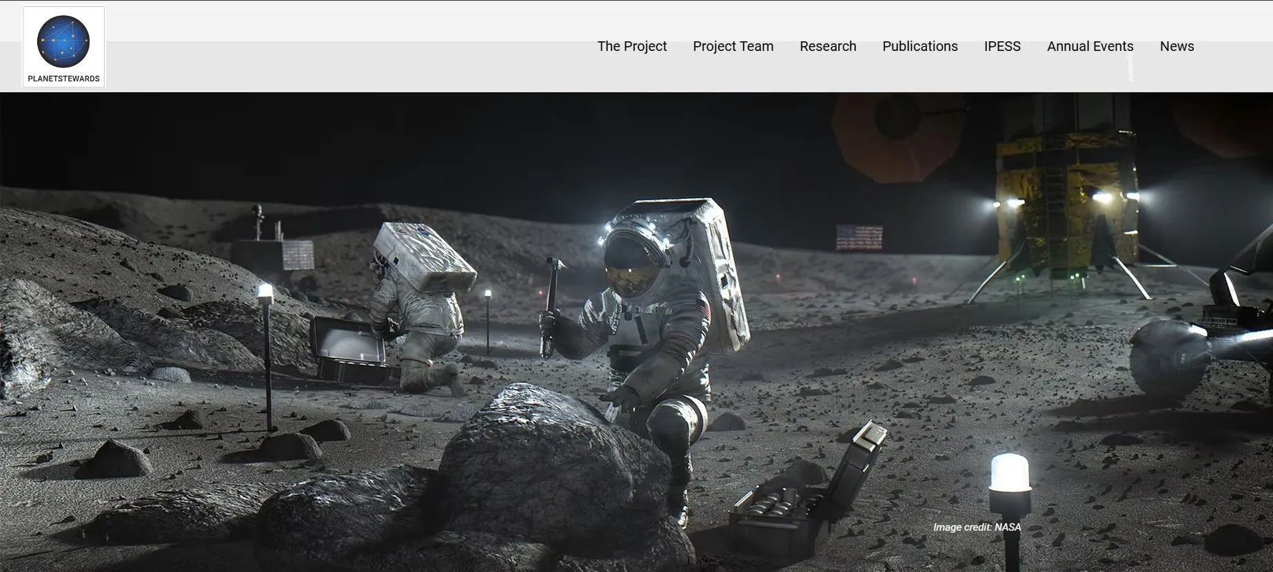
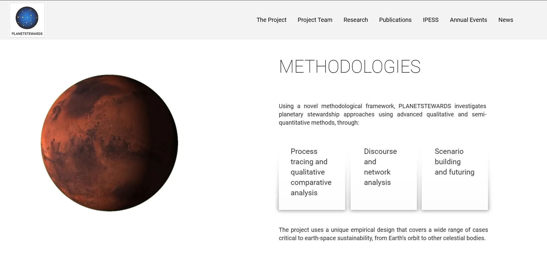
| Placement of the Moon and Mars on the homepage. | Principal Investigator, several rounds | Kept the Earth, Moon, Mars sequence, each paired with a strip of human activity there. |
| Secondary images too large; return to a strip. | Principal Investigator | Cropped them into a 525px strip and applied parallax motion. |
| Abstract submission form “like the contact form of earth-space.today”. | Principal Investigator | Built the Call for Abstracts form and relabelled the button from APPLY to SUBMIT. |
Logo revisions
Earth, Moon, Mars sequence
Earth
Moon
Mars
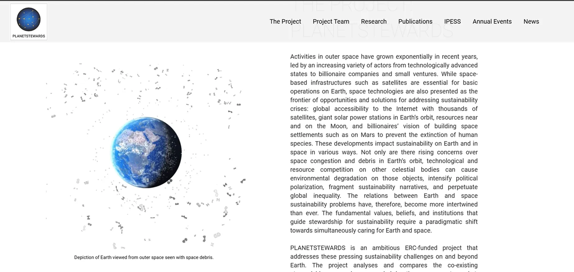
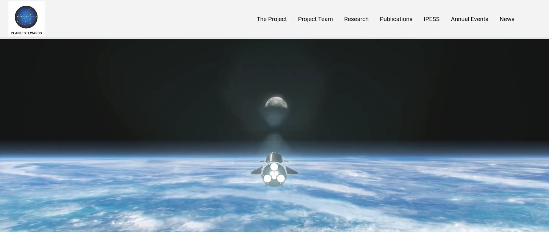
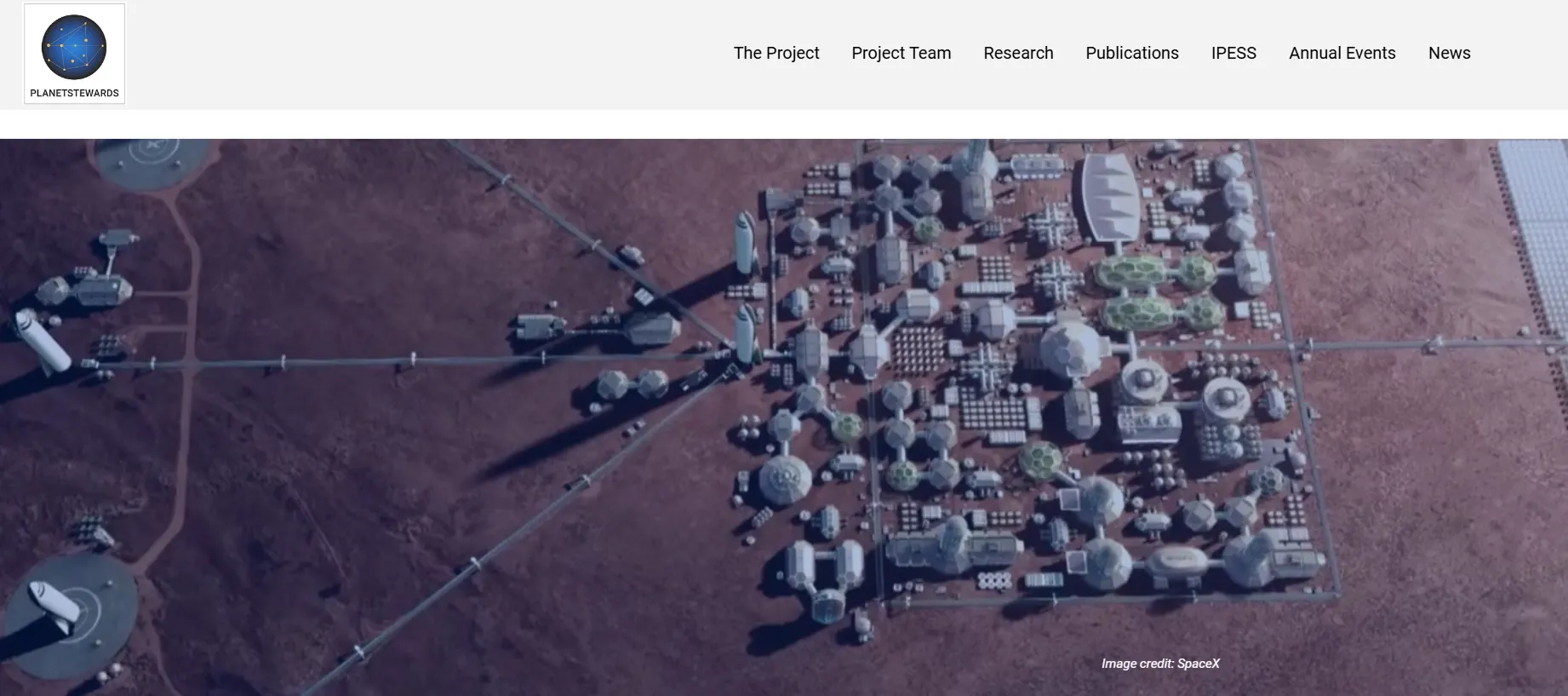
Space debris motion piece
A reviewer asked where the human activity was. The imagery showed planets, not what people have put around them. I produced a short loop of Earth surrounded by orbital debris. The footage was sourced from Freepik and composited and animated in CapCut. It is illustrative, not data-driven. Used on the homepage.
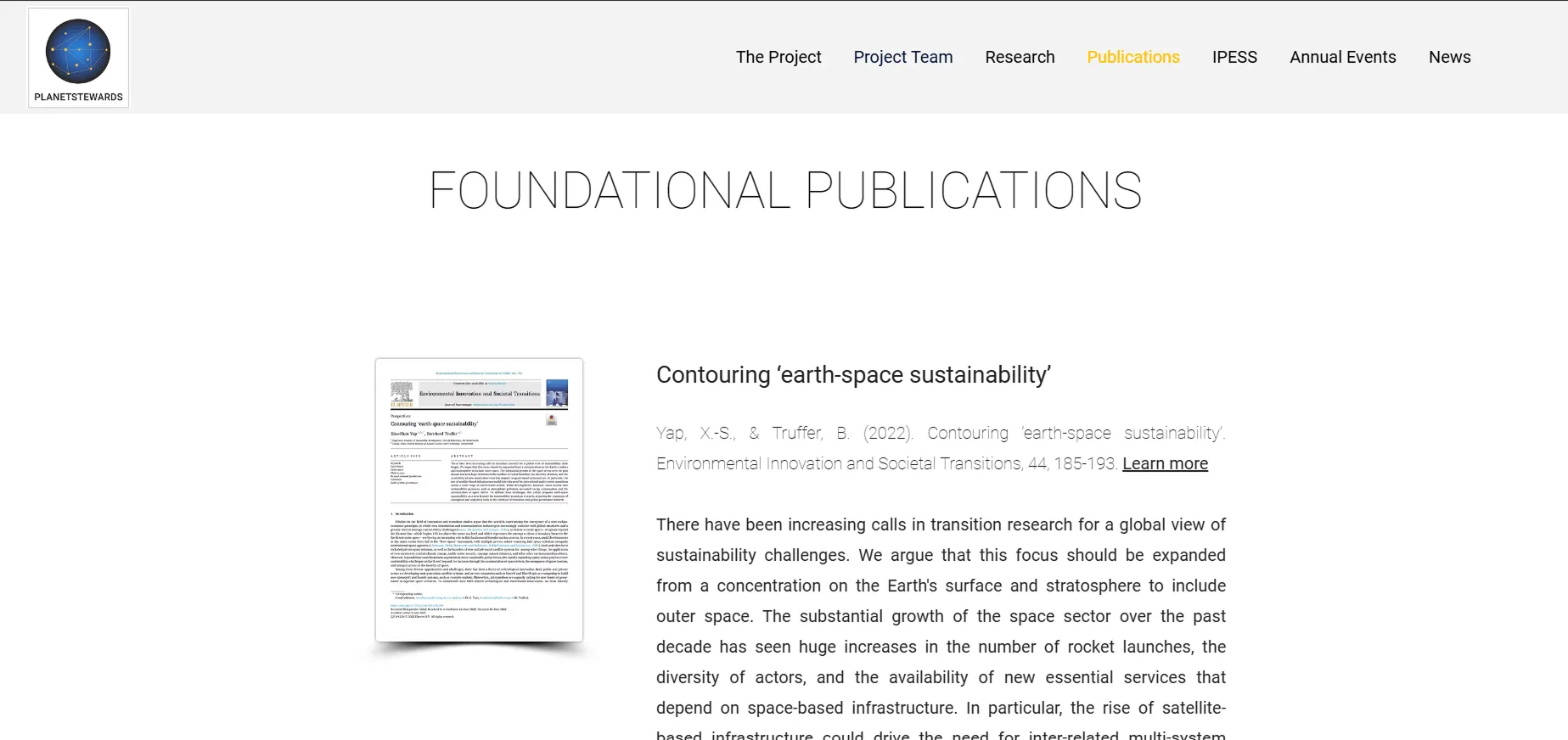
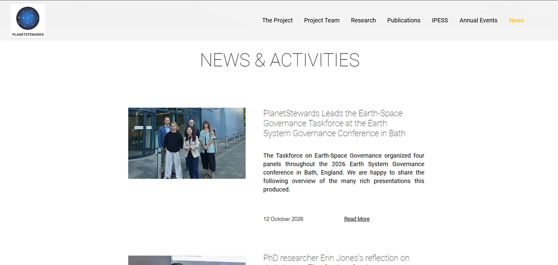
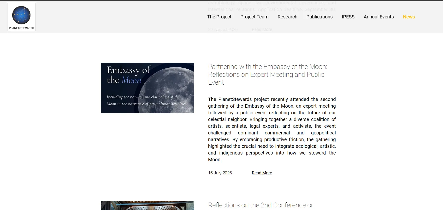
Built to be maintained by researchers
Results
Jun 2024 – Jun 2025 · Wix Analytics
6 minutes 2 seconds
average session length
1,679
unique visitors across 3,295 sessions
61%
of sessions from outside the Netherlands
265
sessions referred from uu.nl, and 265 from LinkedIn (200 referral, 65 organic)
Earth-Space Symposium
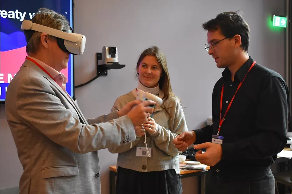
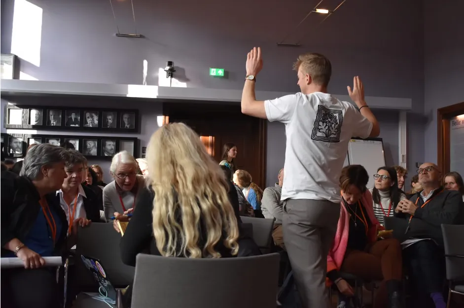
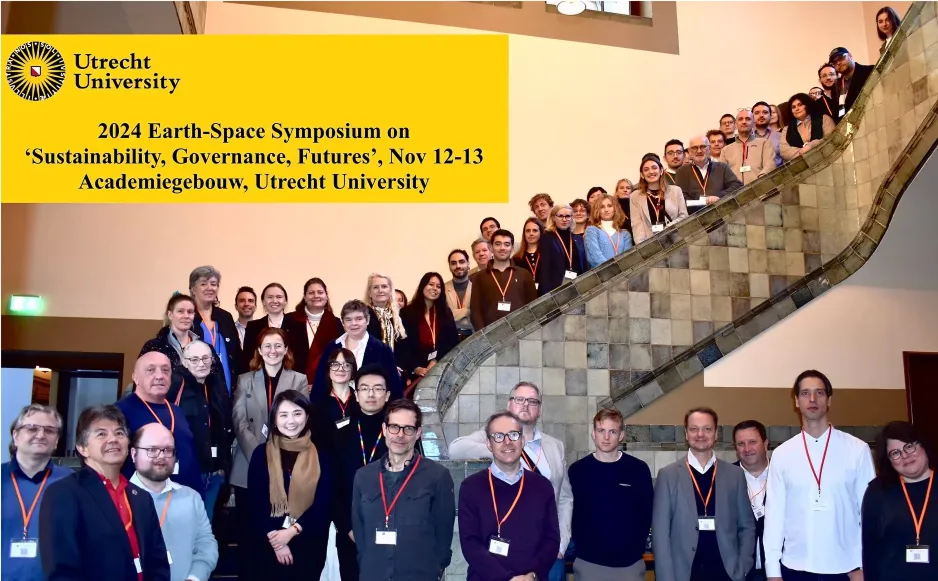
The first Earth-Space Symposium brought 60 scholars, policymakers, artists and practitioners from 21 countries to Utrecht University, filling the venue. I produced the symposium landing page, Call for Papers and registration pages.
Reflection
Every decision had to pass two tests: credible to a professor, inviting to a student. The PI asked for the 2024 Symposium as a top-level menu item with Call for Abstracts beneath it. I built it as requested. Once the programme added a workshop, an academy and a second conference, that slot had to become an Annual Events menu. I should have proposed a structure built for a recurring series when I implemented the request, not just the single event in front of us. Next time I would also test the submission flow with researchers before launch, and set mobile body text left-aligned.